Hello Connetix team,
I’m writing to share some honest feedback regarding your Pastel set.
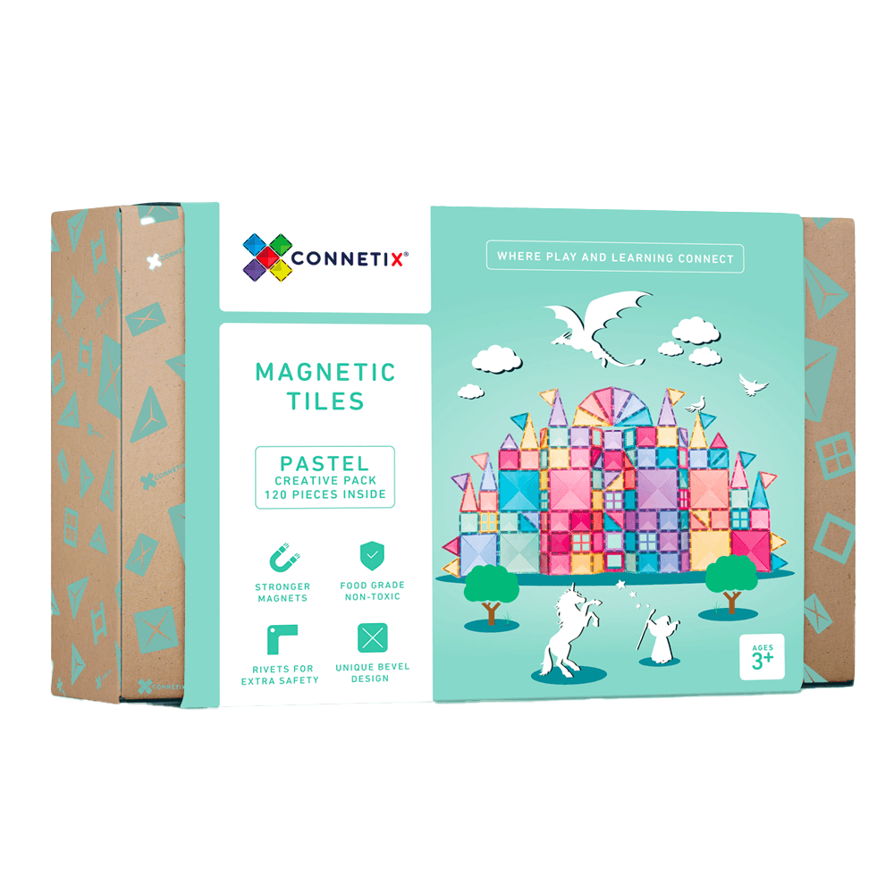
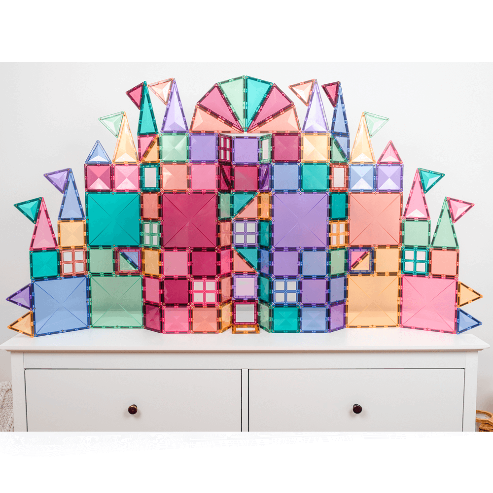
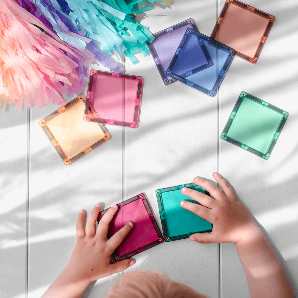
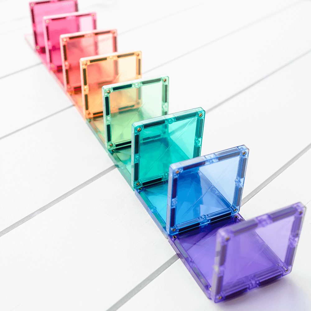
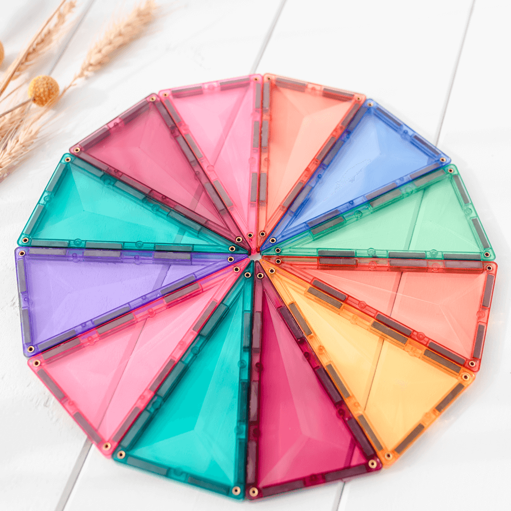
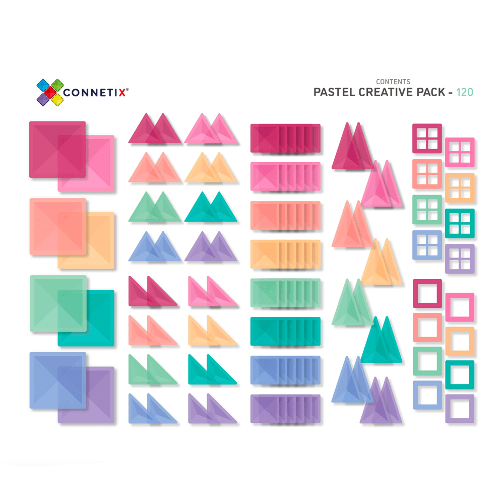
I purchased the set for over $200 more than it was advertised during my daughters actual birthday, specifically because I was looking for a Montessori-style pastel construction set to complement a softer, more “girly” colour palette for my daughter. Based on the advertising images, I was expecting pastel pinks, purples, baby blue, soft butter yellow and soft aqua tones.
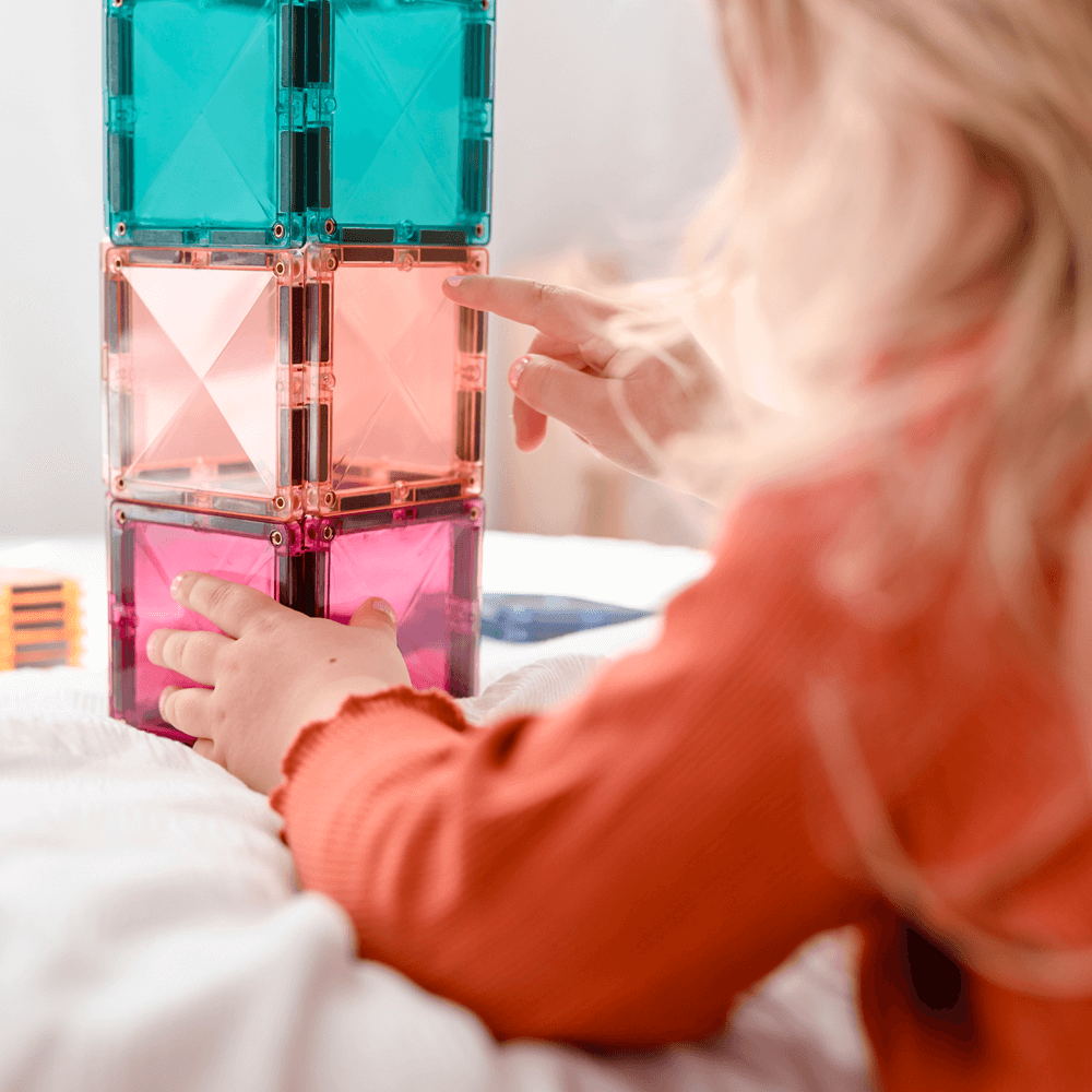
Unfortunately, when we opened the set (on my daughter’s birthday, after a long preorder wait), the colours inside were very different from what was shown online. In person, they look much closer to standard kindergarten/classroom colours rather than the pastel palette advertised. I’ve seen many construction toys used in early childhood settings, and this felt unexpectedly similar — which was disappointing given the premium price and branding.
I absolutely appreciate the quality of Connetix products, which is why I chose your brand and paid full price. However, I do feel the current product photography doesn’t accurately reflect the true colours of the set, and this could easily lead to disappointment for customers purchasing specifically for aesthetic or Montessori-inspired reasons.
I wanted to pass this on as constructive feedback, as clearer or more accurate advertising images could really help manage expectations and avoid similar experiences for other parents.
Thank you for taking the time to read this — I hope it’s helpful.
Kind regards,
Oleksandra Zhukova